ABOUT
Bakeology Cocktails is a cocktail brand inspired by popular desserts. It caters towards the younger demographic of the drinking age for those who like experimenting with unique flavors or just tipping their toes into alcoholic beverages with a touch of fun.
OBJECTIVE
Create an alcohol brand with a unique premise that will draw in the younger ages of the drinking demographic. Using bright colors and unique flavors to create a different offering in the large alcohol market.
Bakeology Cocktails
BRANDING | PACKAGING
BEHIND THE NAME
Since the brand combines the concepts of baking and mixology, I merged the two into one word – Bakeology. I wanted to add ‘Cocktails’ to provide more context.
For the logo mark I combined a cocktail glass with a slice taken out of it to represent a slice of cake. A cherry is added on top as it’s a common embellish on cocktail sticks and is also used as a cake decoration. I used a typeface that felt a bit retro but also spoke to the sophistication of cocktails.
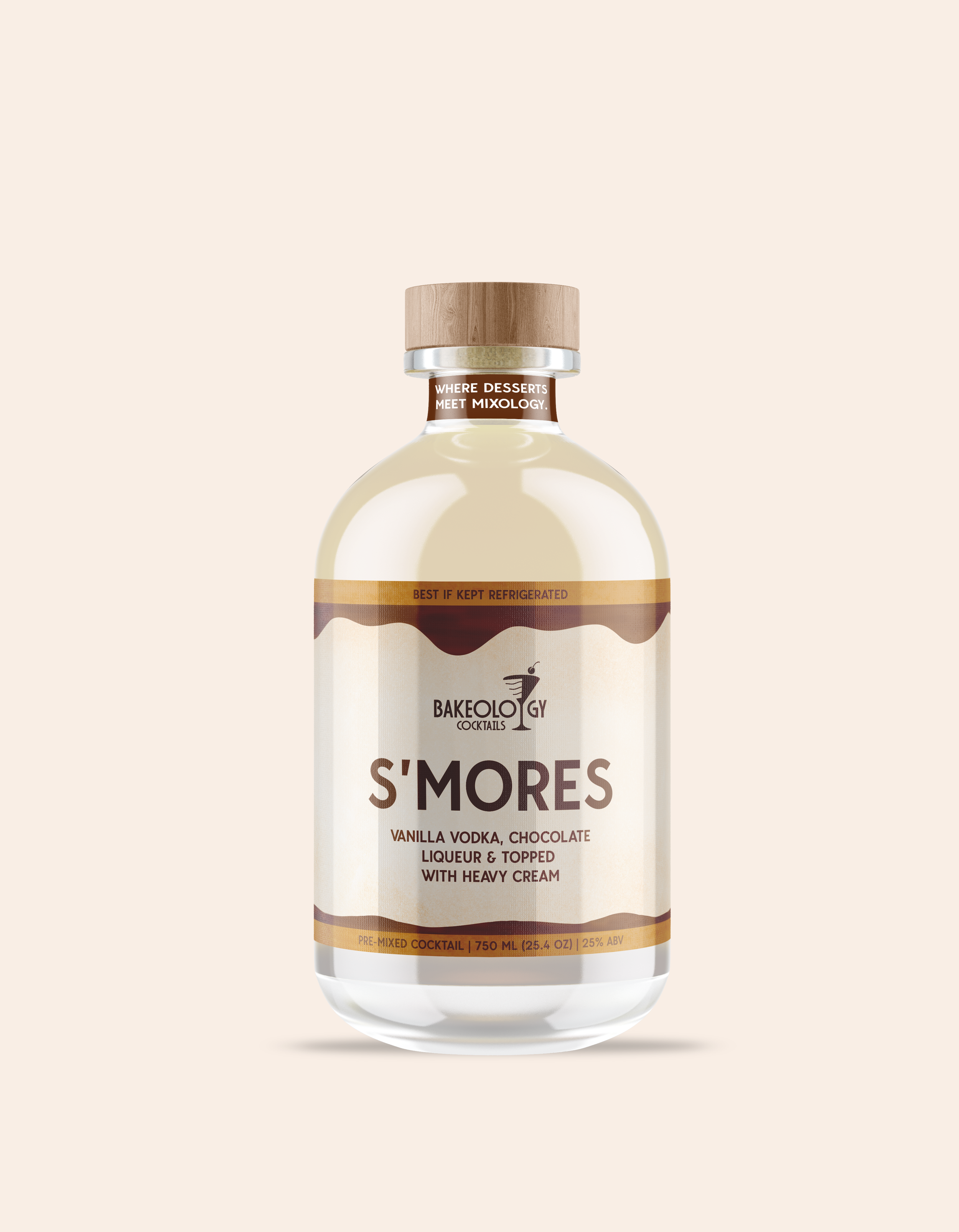
The concept of the brand is pre-mixed cocktails in a bottle. The market for this sort of alcohol form isn’t as commonly known and serves as an introduction to the wide realm of cocktails without the hassle of mixing ingredients together, but ready to go!


The packaging features bold colors to stand out on the shelves and give the brand a playful attitude. I created illustrations on my iPad for the wrappers to add some dimension and feel more organic to go along with that idea of making desserts by hand. Each label showcases a close-up of the featured dessert with colors commonly associated with those desserts.

